Architect Anthony Pettorino continues with his exploration of the relationship between the built environment and human experience.
In my previous column on vision, the primary sense when it comes to our awareness of architecture, I opened the door for digging deeper into the many aspects of the visual world, such as colour, texture, light and shade. For the first of these features, I have decided to first tackle the most elusive one: form.
Form is hard to pin down. It's defined as 'the visible shape or configuration of something' and has synonyms such as shape, structure, construction, arrangement, disposition and appearance. Form is what things are and how they look. Studying the form of a thing, however, removes the surface layer of classification. If a thing looks like a house, it's a house. It looks like a tree, so it's a tree. But once classification is removed, objects are no longer 'houses' or 'trees', they are simply forms: pure manifestations of nature or human invention. Only by seeing beyond classification can form really be appreciated.
I'͛d like to briefly return to the artistic development of children, which I briefly mentioned in a previous article. A fairly common pattern with children's drawings is that as they get older, drawings start becoming representations of what they think they see rather than what is directly in their field of vision. It's a hand because it has five fingers. It's a tree because it has leaves and a trunk. This is the very beginning of where classification gets in the way of our understanding of form. Detailed form can only be perceived in the mind's eye using data sent from just two of our senses: touch and sight. Both have their limitations, but on the whole they do a pretty good job, either separately or together.
In the design of buildings and spaces, form is at the top of the tree in terms of importance. Form is what things look like; the first thing we remember; the first impression. Our perception of form comes way ahead of the detail we recognise later on. It is an instantaneous response, so as we see something, we either like it, don't like it, can't make up our minds or are enticed to delve deeper and it's due to this response that unpicking peoples' reaction to form is tricky. Culture, memories and emotion all mix together and tell us whether a form is right or not.
As you can imagine, this is a huge topic in the world of architecture: it spans the things we know at the symbolic level, then the abstract concept of the underlying, symbol-less visual language for which there is no dictionary. The best analogy to help explain this is language itself. Whether we speak English, Lithuanian or Esperanto, a door is a door and 'happy' is 'happy' egardless of the word (symbol) we use to describe it. Therefore, underneath the word is the metalanguage: the meaning that transcends the word.
Form makes us feel something, either by connecting with a memory or by communicating an emotion or concept using the visual metalanguage designers aspire to grasping. The famous early modernist adage 'form follows function' was coined by the American architect Louis Sullivan in the late 19th Century. In many ways, it was a relief, as if all of form's complexities were now able to be reduced to a simple rule. It looks like it looks because it does what it does. The early days of high rise buildings and the industrial revolution became a great excuse to just get stuff done. Ironically, Sullivan's buildings were beautifully adorned with ornament and detail, a sweet glaze over what were largely commercial office blocks.
In design, form both tells a story and creates an experience. Elegance is every designer's aspiration, and elegance is mainly about form. Elegance can be simple or elaborate, but it's that first impression that tells you whether it's right or not and then, if the detail follows through, your concept has worked. There are two things I am reminded of here: the Georgian motto 'there is virtue in restraint' and Apple Inc.'s (or Steve Job's) obsession with making the complex appear incredibly simple.
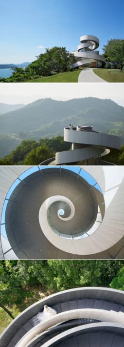
Looking for an appropriate image to put alongside this article was difficult. There were debates with my colleagues at the office, and the process of what seemed like browsing through at least a thousand images, experimenting with search phrase after search phrase. The images you see here I had never seen before, and discovered them through trial and error alone. It's a wedding chapel in Hiroshima, Japan, designed by NAP Architects and Hiroshi Nakamura.
(Images courtesy of the website Portraits of Elegance: portrel.com).
The chapel consists of two spiral stairs, lightly embracing each other and then joining at the top, as will the bride and groom as they make their own separate ascents as part of the marriage ceremony. The resulting form is full of uplifting symbolism, yet remains simple and truly elegant.
Anthony is a director of Pettorino Design Ltd in Witney and can be contacted on 01993402993 or by email at anthony@pettorinodesign.co.uk


