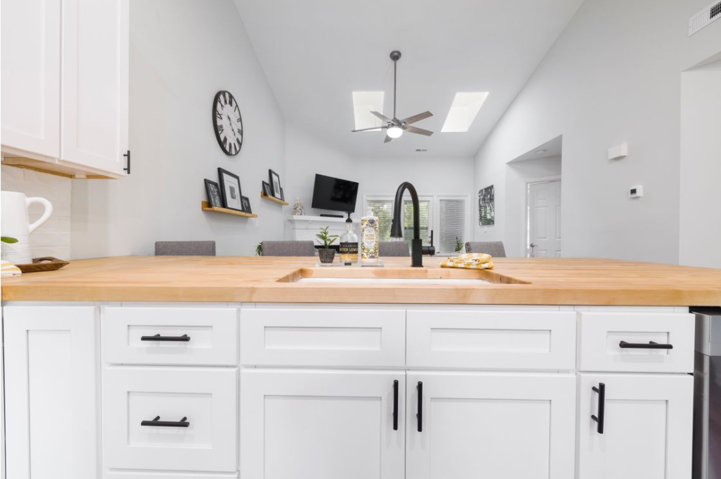
A muted earthy frame can feel calm and refined. A bold, high-contrast palette can feel modern, playful, or cinematic. Colors in photography define the message, the mood, and the photographer's visual identity.
Like any art form, photography highly depends on trends. Trends particularly affect the tone choices that help you stay relevant in the industry. The properly chosen palettes define how a portfolio is perceived, how a brand shoot connects with an audience, or how a travel image stands out in a crowded feed.
In this article, we will show how color trends influence photography styles and how to use them with intention. It will keep your images polished and relevant, highlighting your unique creative vision rather than sacrificing it.
Trends That Shape the Visual Style in 2026
Regardless of your favorite style and genre, you will need good color combinations to make your images look modern and emotionally engaging. Below are three directions that continue to influence visual style and can be adapted to different types of shoots.
Bold Cinematic Contrast
Deeper shadows, controlled highlights, and bold combinations of complementary colors (red + green, orange + blue, or yellow + purple) add drama and energy even when the compositions are simple. They work for fashion and sports photography and can also be helpful for visual marketing campaigns focused on energy and movement (sportswear, energy drinks, etc.).
Build the frame around one or two dominant colors. For example, a city shot with cool shadows and one strong orange sign will usually feel more intentional than a frame where every hue is boosted. If you are only learning how to edit photos, use pre-made LUT photography packs for photo collections that grab attention immediately but remain consistent and recognizable.
Soft Natural Palettes
Beige, cream, olive, dusty blue, and warm, faded neutrals make pictures feel polished yet not overprocessed. It is especially important for portraits, visual storytelling, and brand photography that convey authenticity, naturalness, and humanity (beauty and wellness, organic food, etc.).
The viewer focuses on the person, not on aggressive color. Gentler contrasts and uncluttered backgrounds will maximize the impact. A cream sweater in window light, an olive jacket in a quiet street, or a faded blue wall behind a portrait can make your lifestyle portrait more relatable without visually overwhelming the viewers.
Nostalgic Film-Inspired Tones
Soft fades, lifted blacks, slightly muted saturation, and small color shifts bring up memories and evoke nostalgia. The film effects make digital photos warmer and more emotional. Fine art, visual documentary, and family portraits will especially benefit from this trend. Use it when emotions and textures are your main creative priorities.
A quiet café scene, a rainy street, an old interior, or a casual portrait can all gain depth from warmer fades and gentler contrast. Earthy tones emphasize melancholy and let the viewer immerse themselves into your narrative.
Getting Inspired Without Copying: Make Trends Work for You
Applying a trend does not mean copying what someone else has already done. It means understanding your core message and using tones and shades as tools to transmit it more effectively in the modern world. What should people feel when they see your work? Do you want your portraits to feel calm and intimate? Do you want your travel images to feel vivid and cinematic?
Your subject is your main priority; all the creative concepts you use should align with it and revolve around it. A soft, faded palette may work beautifully for a family session because it feels warm and approachable. The same treatment may weaken a city night shot that needs contrast and tension.
The trends we described above are versatile, but they still need some genre-specific fine-tuning. Portraits and product shots require more precise color work. Give yourself more freedom in travel, fashion, or street photography. These genres encourage bold stylization.
Repeat only a few color decisions across a set to make your portfolio recognizable. Built-in presets in your photo editing software can be a good starting point. Ensure the presets are customizable so you can fine-tune every photo individually and develop a unique creative style rather than relying on automatic enhancements.
Mistakes to Avoid
- Oversaturated images: Stronger color is not always better, and too much intensity can make the image tiring to look at. In landscape photos, oversaturation ruins the atmosphere: sunsets become too harsh, grass turns neon, and water loses its natural depth.
- Unrealistic edits: Keep skin, skies, and product tones believable. Grabbing the viewers' attention by lying to them will not give you the recognition you want, especially in commercial photography and personal branding, which require accuracy and trustworthiness.
- The same trending look in every frame: Different scenes need different treatment. A warm, nostalgic fade may work beautifully for a café portrait or a quiet street at sunset, but the same treatment can make a snowy mountain scene look muddy and unnatural.
- Compromising your image for a trend: Do not sacrifice visual consistency for one that doesn't fit your style. Randomness, no matter how beautiful it looks, can disappoint your audience and create an impression that you don't have your own creative vision.
- Neglecting lighting conditions: A palette that looks great in soft daylight may fall apart under mixed indoor light or harsh midday sun. Your shade choices and illumination should work in tandem, not contradict each other.
Conclusion
Understanding and intentionally applying color trends can significantly enhance the emotional impact and relevance of the photography work. Trends help photographers convey their unique vision while staying connected with their audience. Integrate trends into your creative workflow to make your images stand out and be compelling.